Brigantia Organic
Brigantia Organic
Brigantia Organic is a premium organic food brand built on the idea that purity, provenance and taste should never be compromised. Positioned at the intersection of wellness and indulgence, the brand wanted a visual identity that could communicate trust, quality and natural richness without falling into the trap of generic organic aesthetics. Richest Branding partnered with Brigantia to create a refined, earthy branding and packaging system that feels authentic, elevated and deeply connected to the source.
Industry
Services
Challenge
Brigantia Organic operates in a category where buyers expect absolute clarity on ingredients, origins and values. The brand needed an identity that could signal premium quality and organic integrity without feeling clinical, natural without becoming rustic and consistent enough to carry multiple product lines without losing its core sense of trust. The challenge was to create packaging that feels luxurious and pure at first glance, stands apart on crowded shelves and communicates the brand’s organic positioning without sounding generic.
Approach
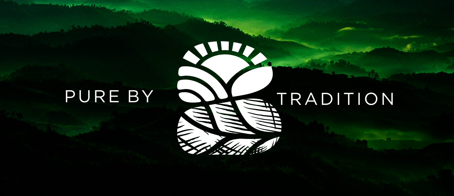
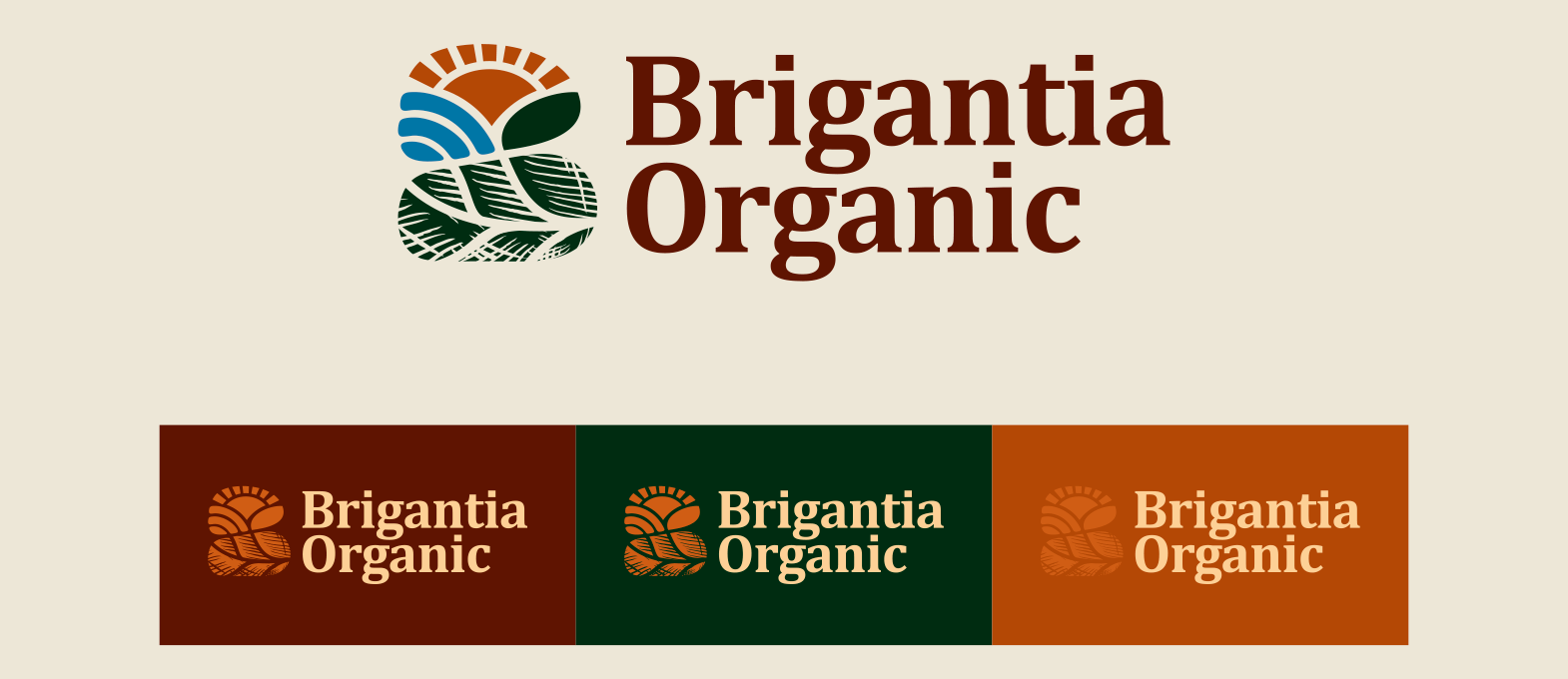
We anchored the identity in three ideas: purity, provenance and richness. A deep, earthy colour palette inspired by soil, harvest and raw ingredients, clean and confident typography and a logo system that feels grounded and timeless. The approach balanced the credibility of organic certification with the warmth of real food, ensuring the brand felt reliable and inviting in equal measure.
Process
We began by mapping Brigantia’s core product range, sourcing stories and audience expectations to understand how the brand could feel premium without becoming distant. From there, we built the logo, defined the colour and typography system and extended the identity across packaging, labels and marketing materials to ensure every touchpoint felt like a promise of quality and care.
Result
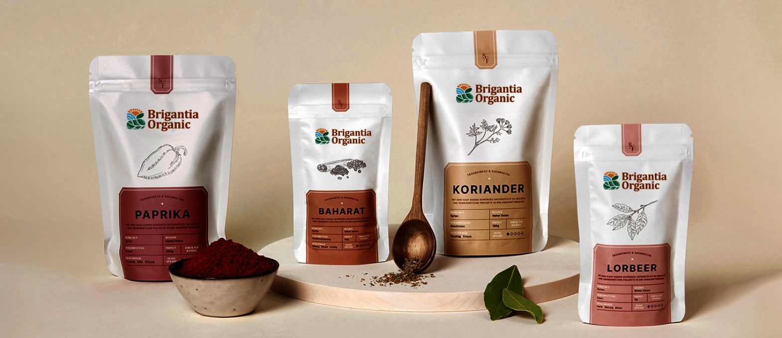
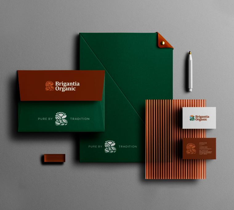
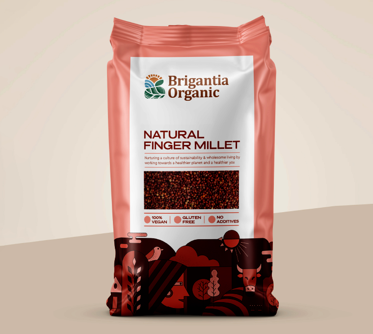
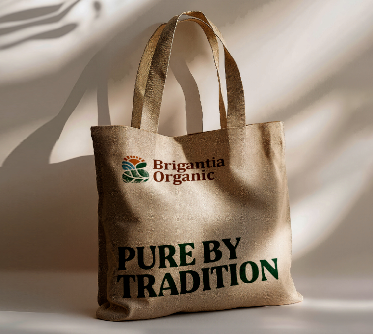
Brigantia Organic now carries a visual identity that feels consistent, elevated and deeply trustworthy across every format, giving buyers instant recognition and a sense of confidence from the first interaction. Packaging, labels and marketing materials all speak one refined, earthy language.
The brand today reads as premium, organic and authentic, exactly what a high-end organic food brand needs to command attention, justify its price and build long-term loyalty.
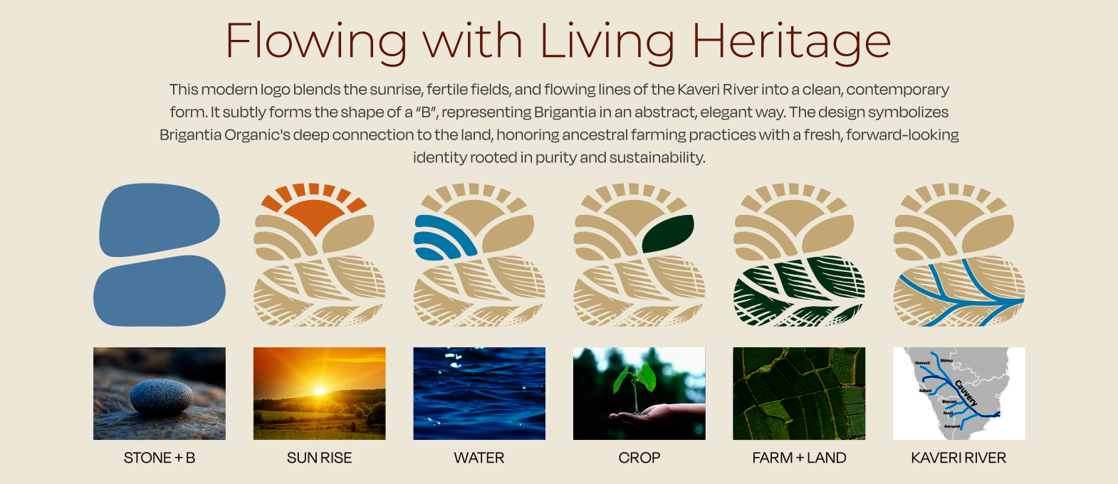
Crafting a High-Impact and Experience-Driven Identity for Brigantia Organic
Richest Branding developed a refined, earthy visual identity system for Brigantia Organic that works seamlessly across packaging, marketing and digital presence. We crafted a premium design language, deep colour palette and confident typography to reflect the brand’s focus on purity, provenance and natural richness.
The communication system features subtle texture cues, organic tones and packaging architecture that keeps every product feeling elevated and authentic. Each execution reinforces trust, quality and recognition, positioning Brigantia Organic as a brand that doesn’t just sell food, it honours the source.
What's Next