Nutri Chunks
Visit SiteNutri Chunks
Nutri Chunks is a health-forward snack brand built for people who want taste without the guilt. Positioned at the intersection of nutrition and indulgence, the brand wanted a visual identity that could communicate both benefits at once, clean, credible and still craveable. Richest Branding partnered with Nutri Chunks to build a vibrant, trust-building packaging system that speaks the language of modern healthy snacking, clear, colourful and instantly appealing.
Industry
Services
Challenge
Nutri Chunks operates in the fast-growing healthy snack category, where buyers expect clarity on nutrition, ingredients and benefits without compromising on taste appeal. The brand lacked a unified visual system that could hold its expanding flavour range together while meeting the clean, credible aesthetic that health-conscious shoppers expect. The challenge was to create packaging that feels premium and trustworthy at first glance, stands apart on crowded shelves and communicates the brand’s health-first positioning without feeling clinical or boring.
Approach
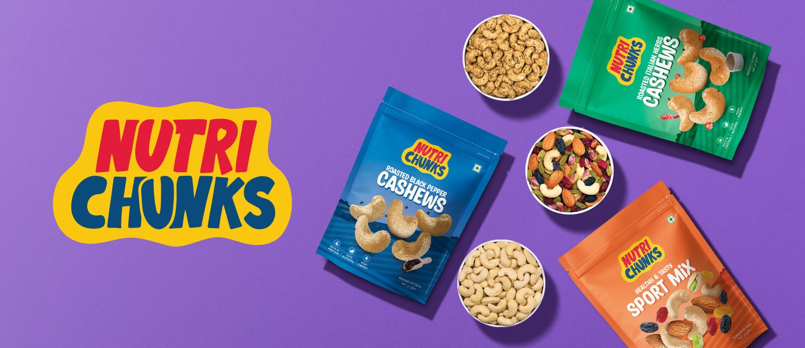
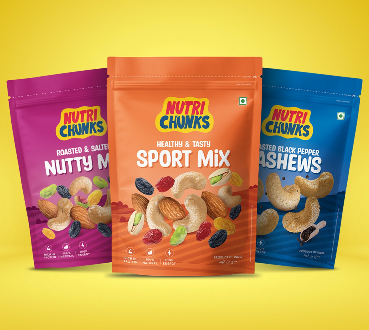
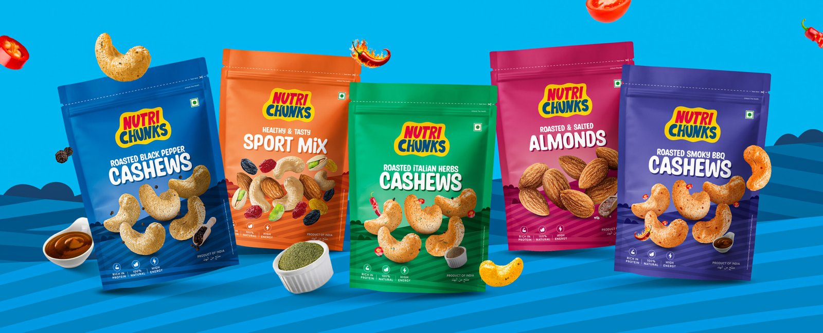
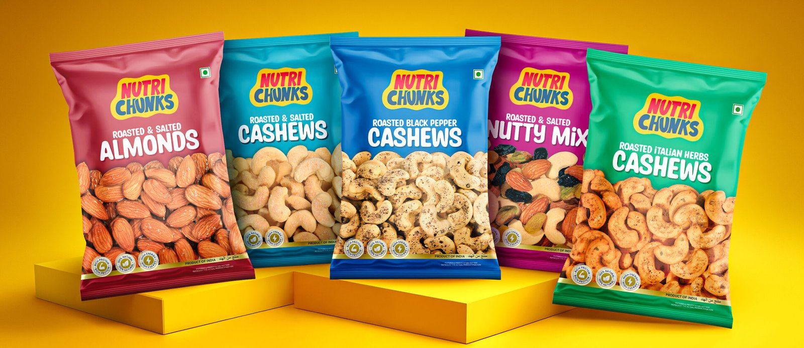
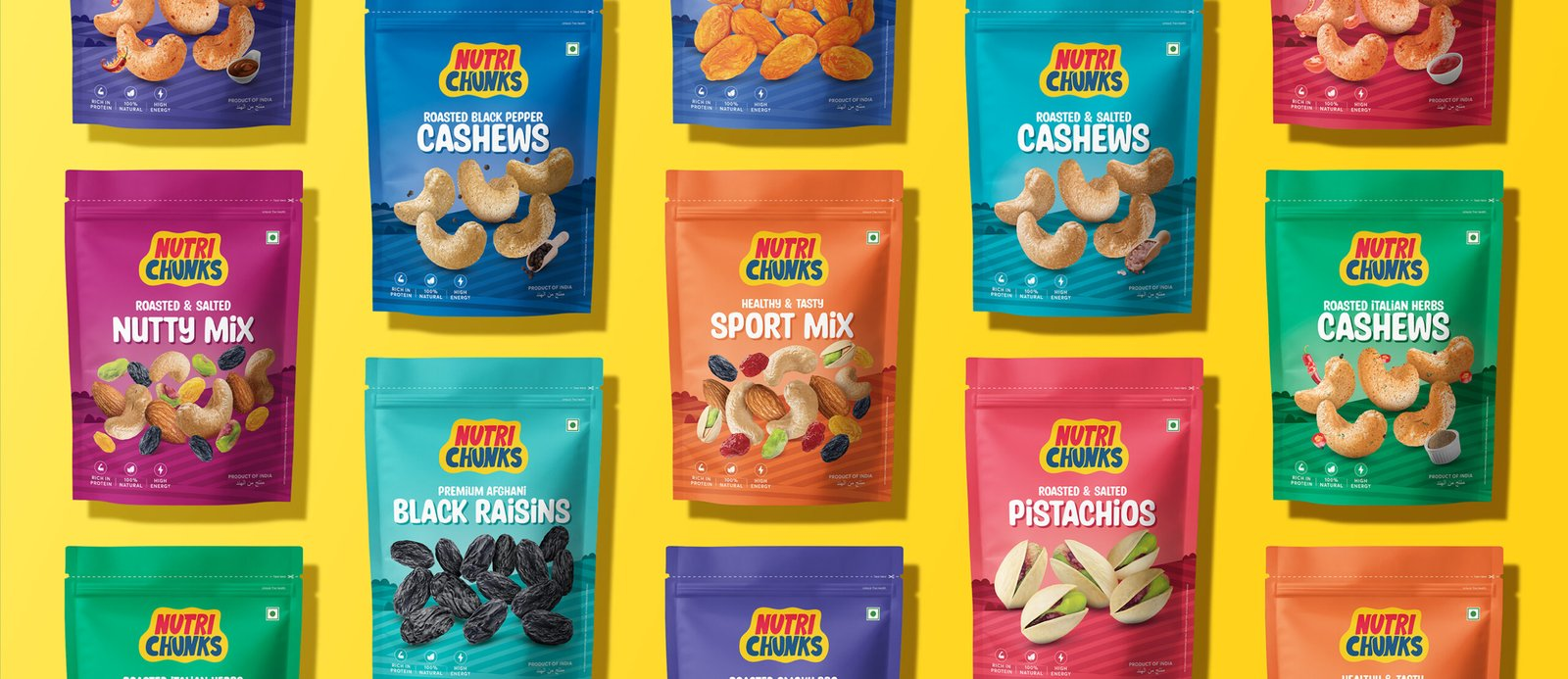
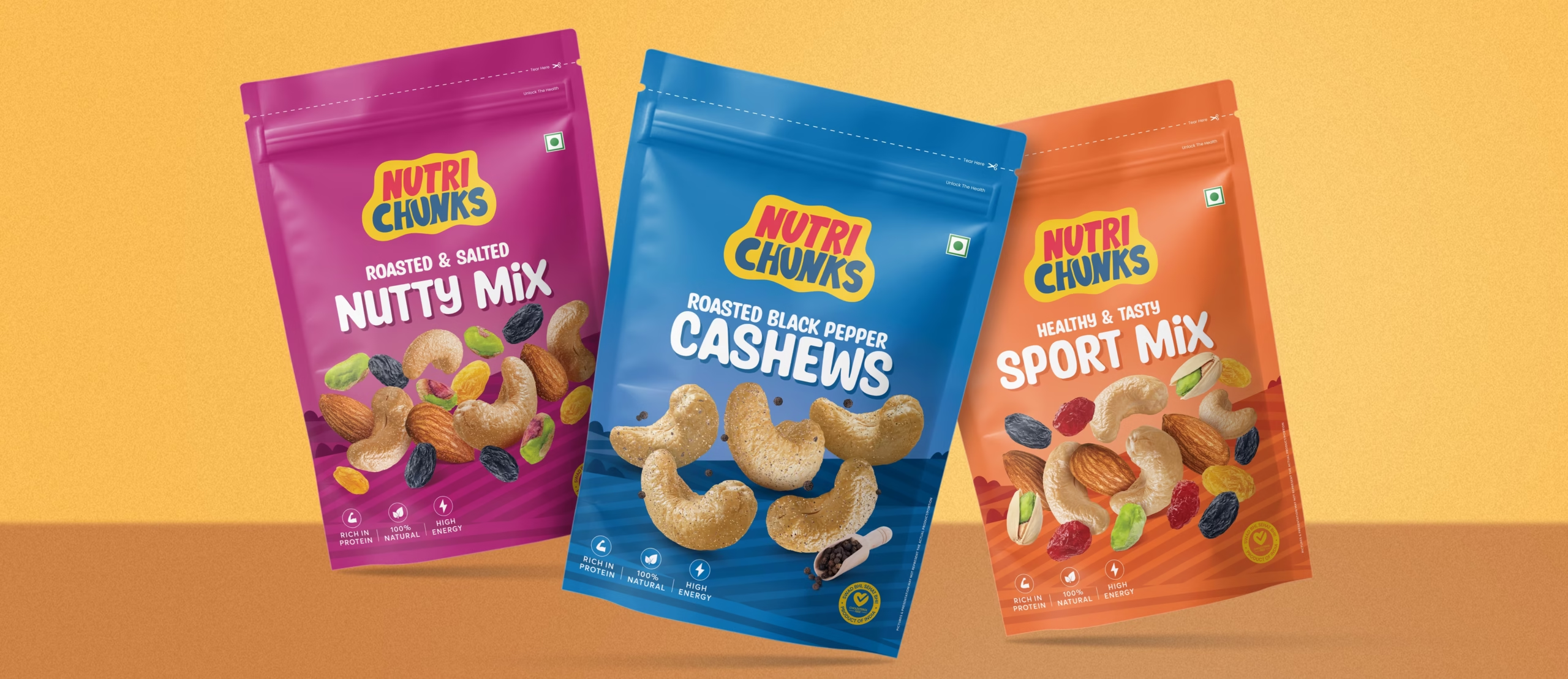
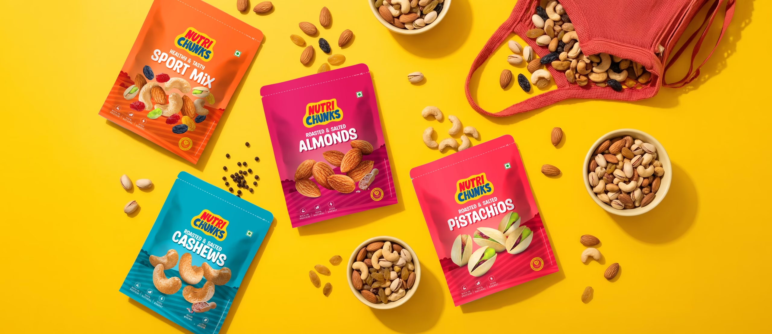
We anchored the identity in three qualities every health-conscious buyer looks for first: clarity, colour and confidence. Clean typography, vibrant colour coding by flavour and a layout system that puts the product and key benefits front and centre. The approach balanced the credibility of nutrition with the energy of snacking, ensuring the brand felt reliable and craveable in equal measure.
Process
We began by mapping Nutri Chunks’ full flavour range to understand how one visual system could flex across variants without losing consistency. From there, we built the packaging architecture, defined the colour coding by flavour profile and extended the system across packs, labels and marketing materials, ensuring every touchpoint carried the same standard of transparency and visual appeal.
Result
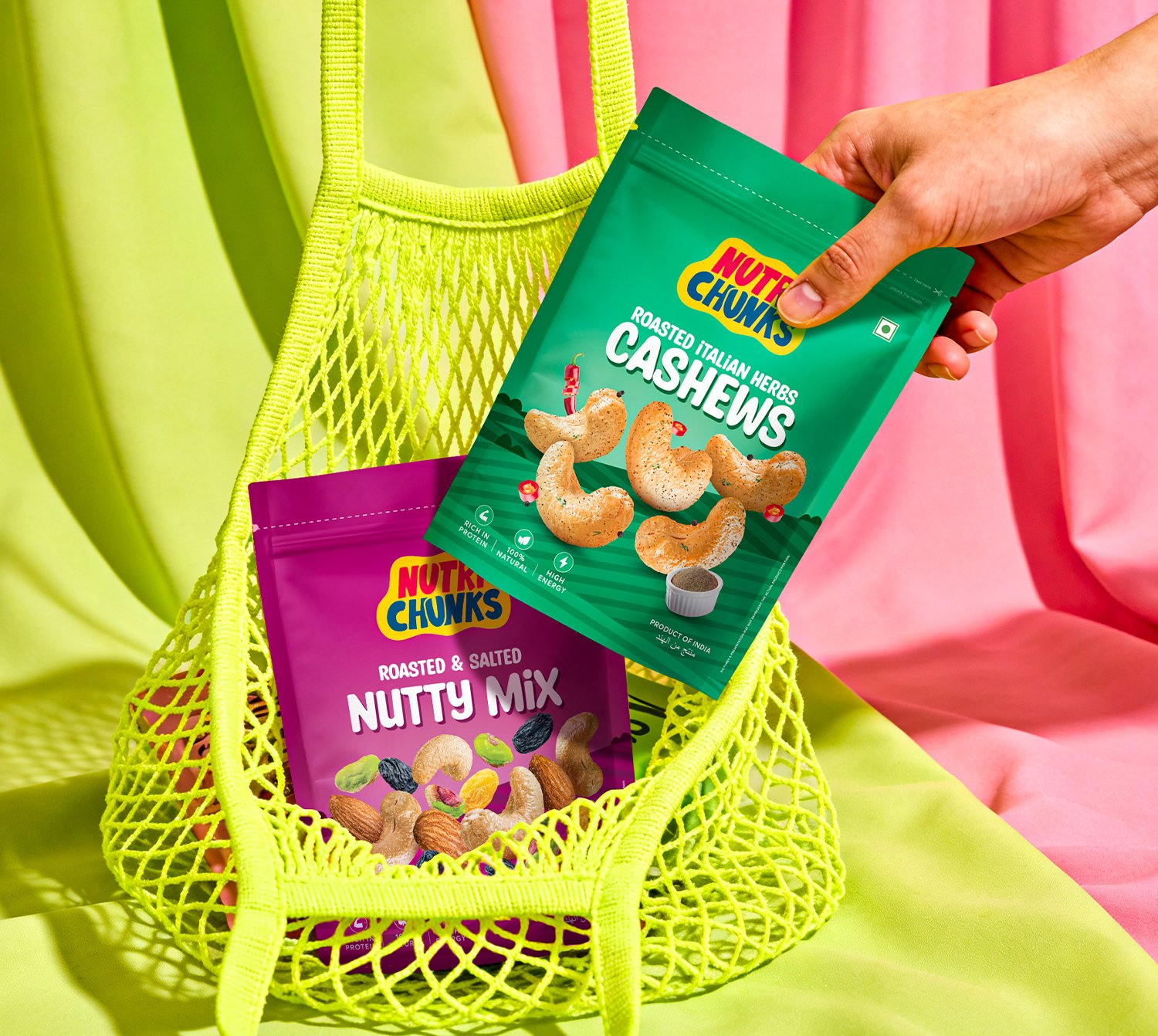
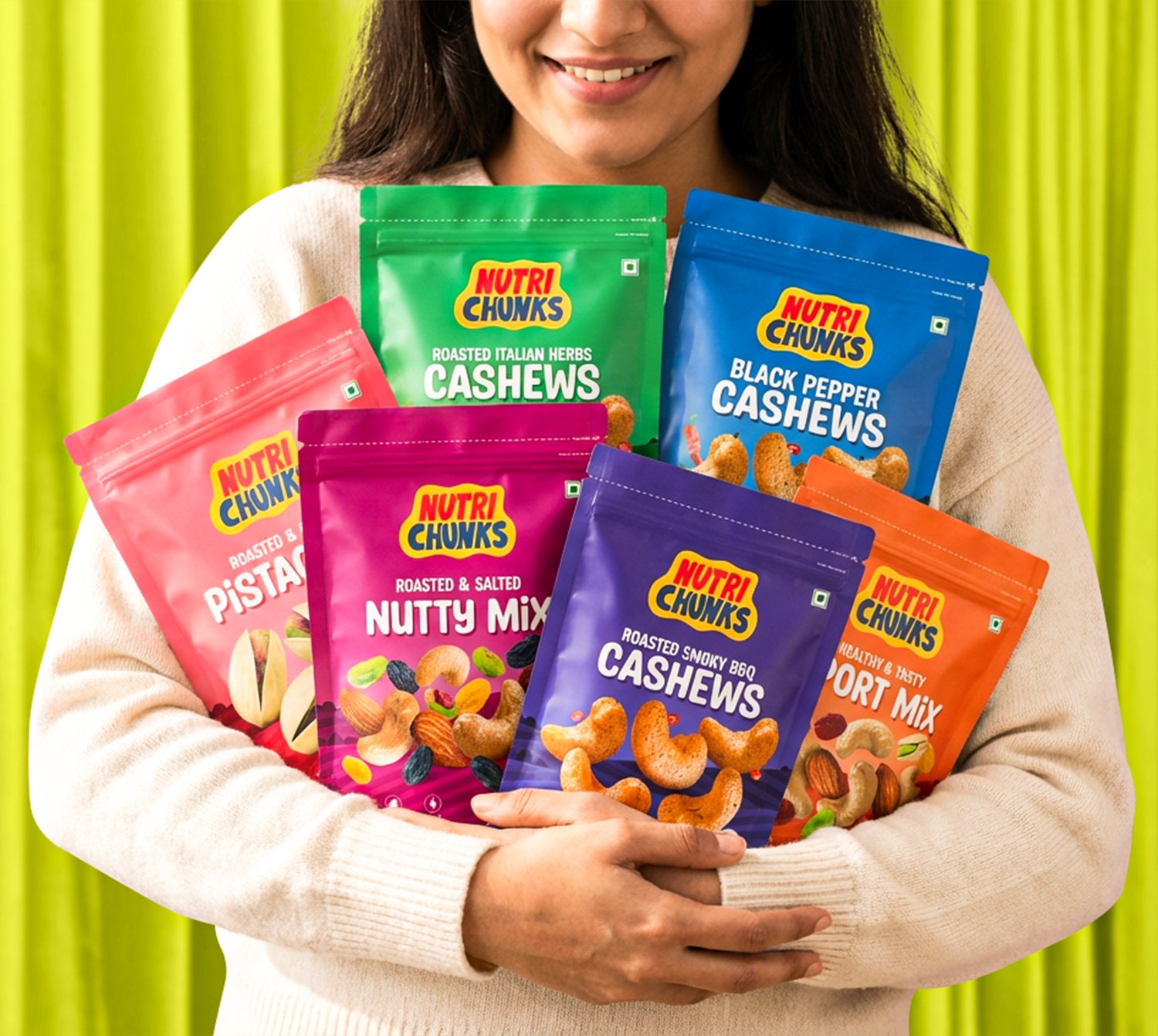
Nutri Chunks now carries packaging that feels consistent across every flavour, giving buyers instant recognition whether they’re picking up classic or a new variant. Packs, labels and collateral all speak one visual language.
The brand today reads as premium, healthy and approachable at first glance, exactly what a modern wellness snack brand needs to earn trust and drive trial before a single word is read.
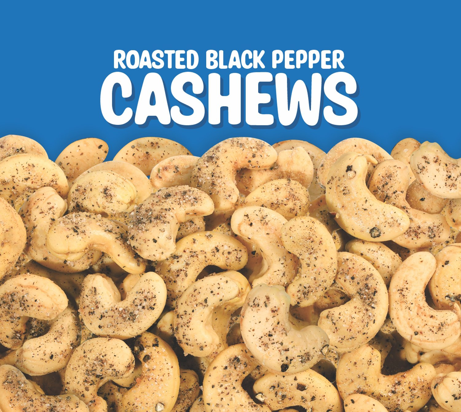
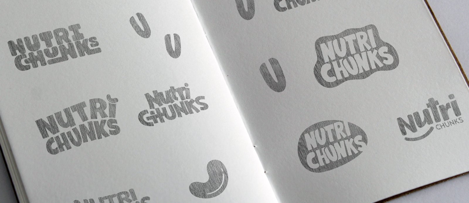
Crafting a High-Impact and Experience-Driven Identity for Nutri Chunks
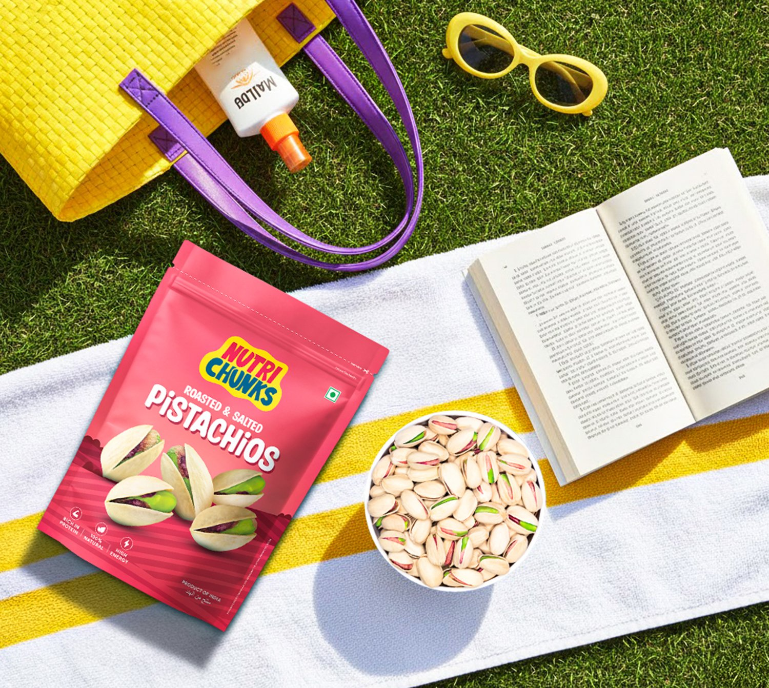
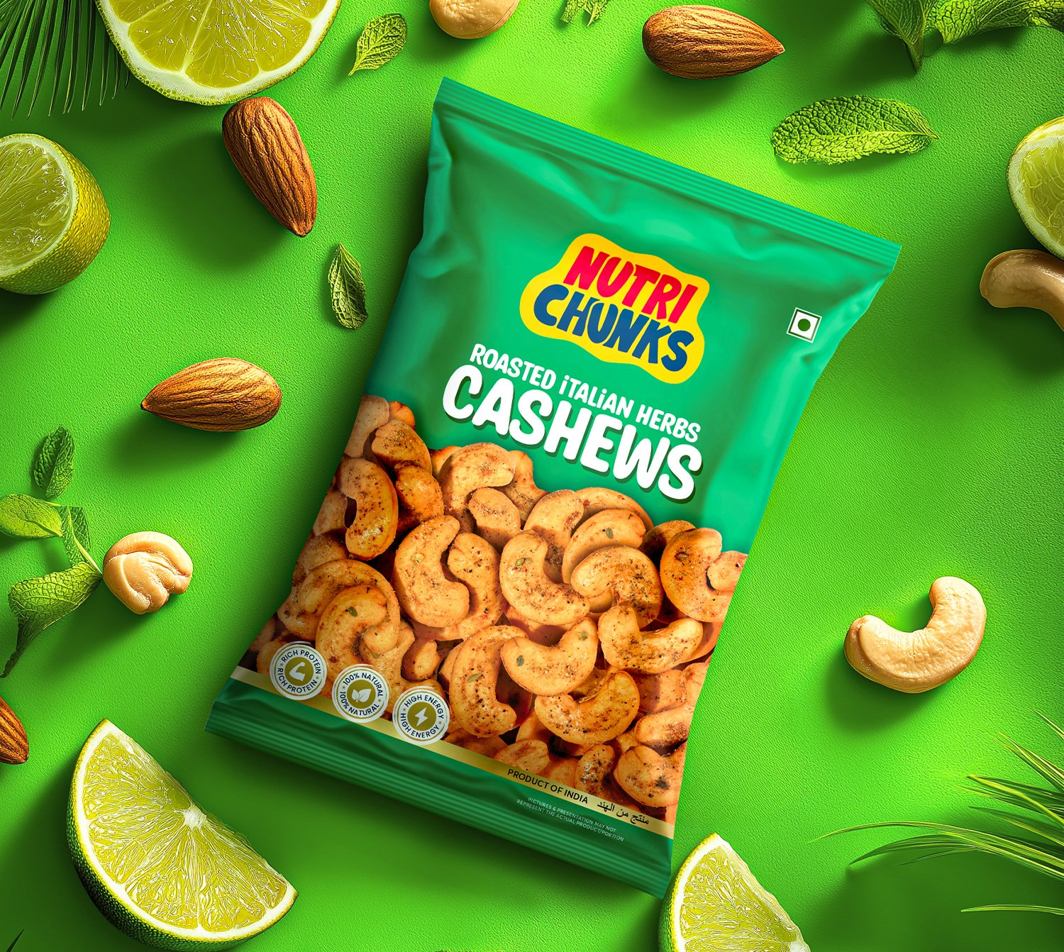
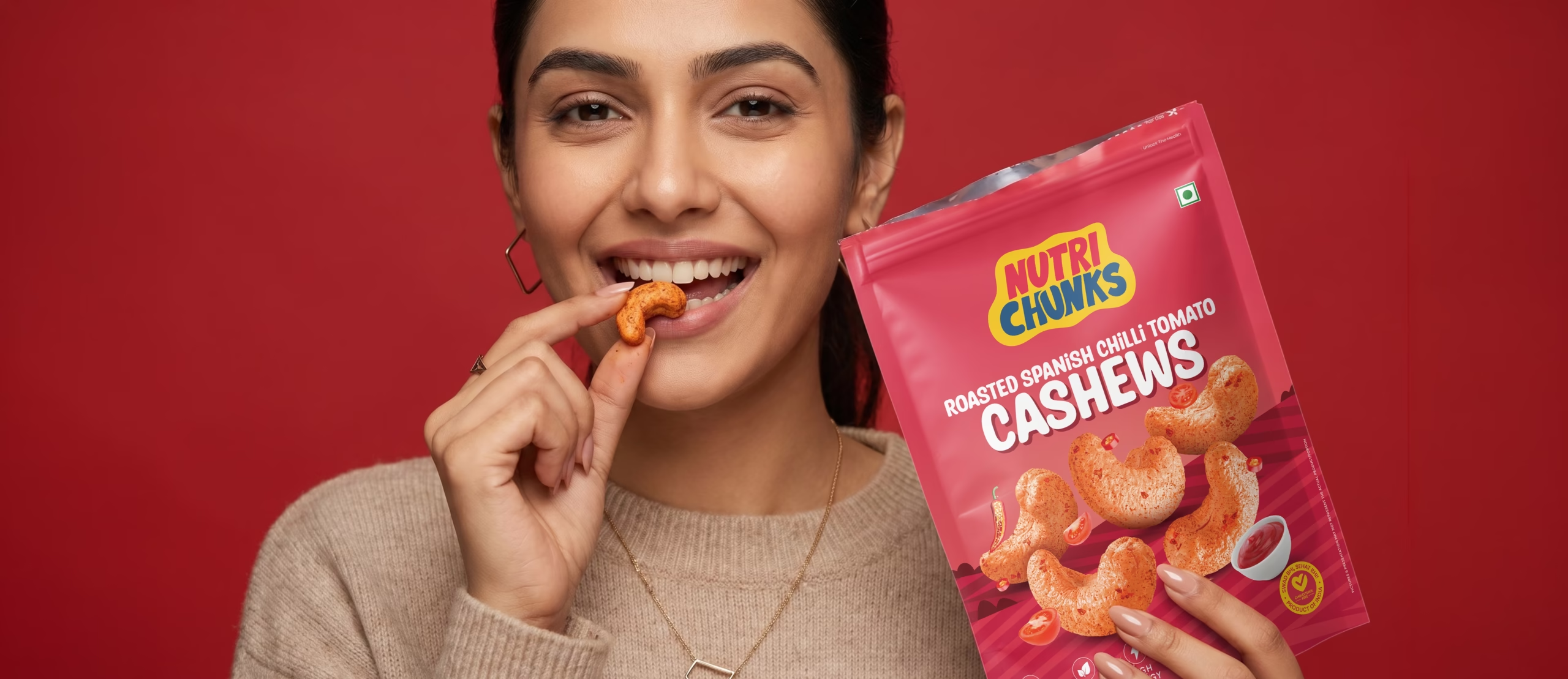
Richest Branding developed a vibrant, nutrition-forward visual identity system for Nutri Chunks that works seamlessly across packaging, marketing and digital presence. We crafted a clean, confident design language, structured layouts and a bold colour system to reflect the brand’s health credentials and commitment to great taste.
The communication system features clean typography, vibrant colour coding and packaging architecture that stays consistent across every flavour variant. Each execution reinforces trust, nutrition and recognition, positioning Nutri Chunks as a dependable, health-first choice for wellness snack buyers across India.
What's Next