Wellhabit
Visit SiteWellhabit
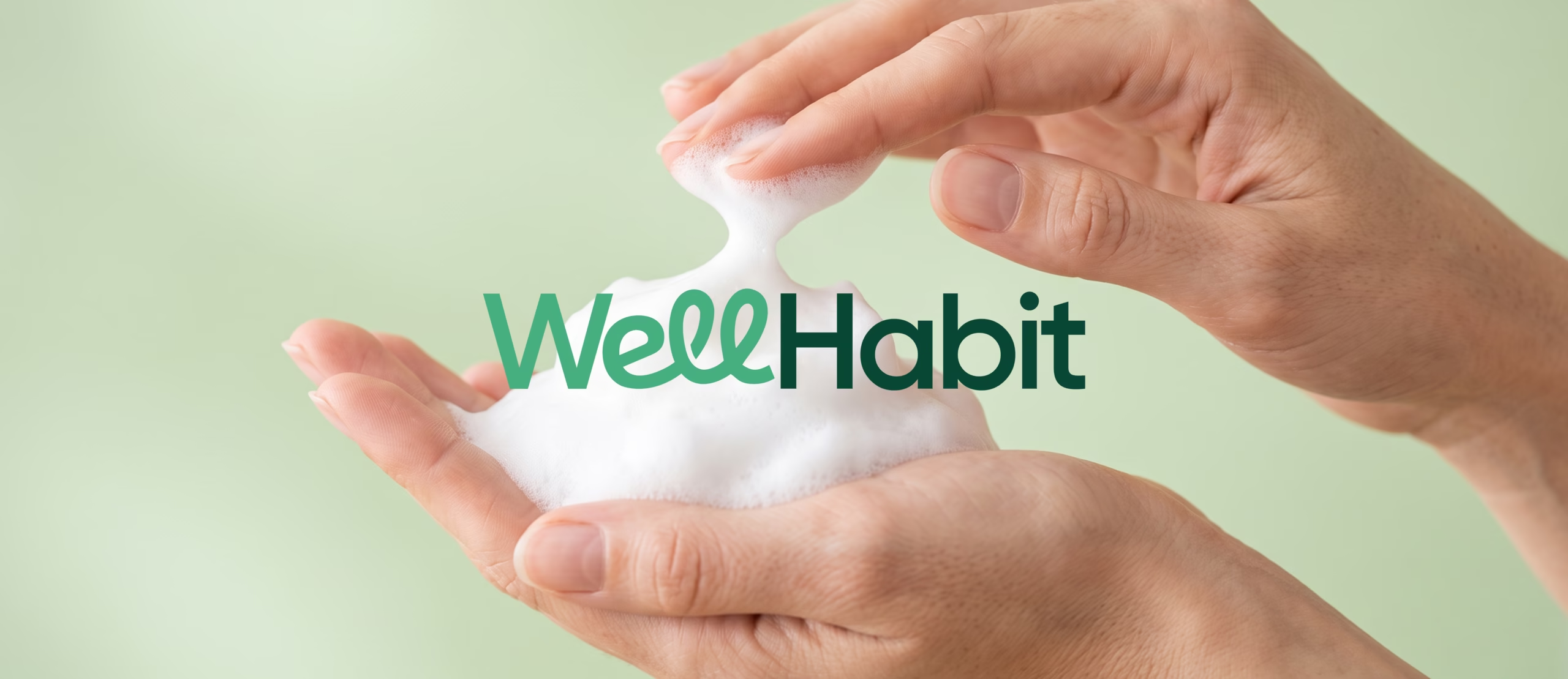
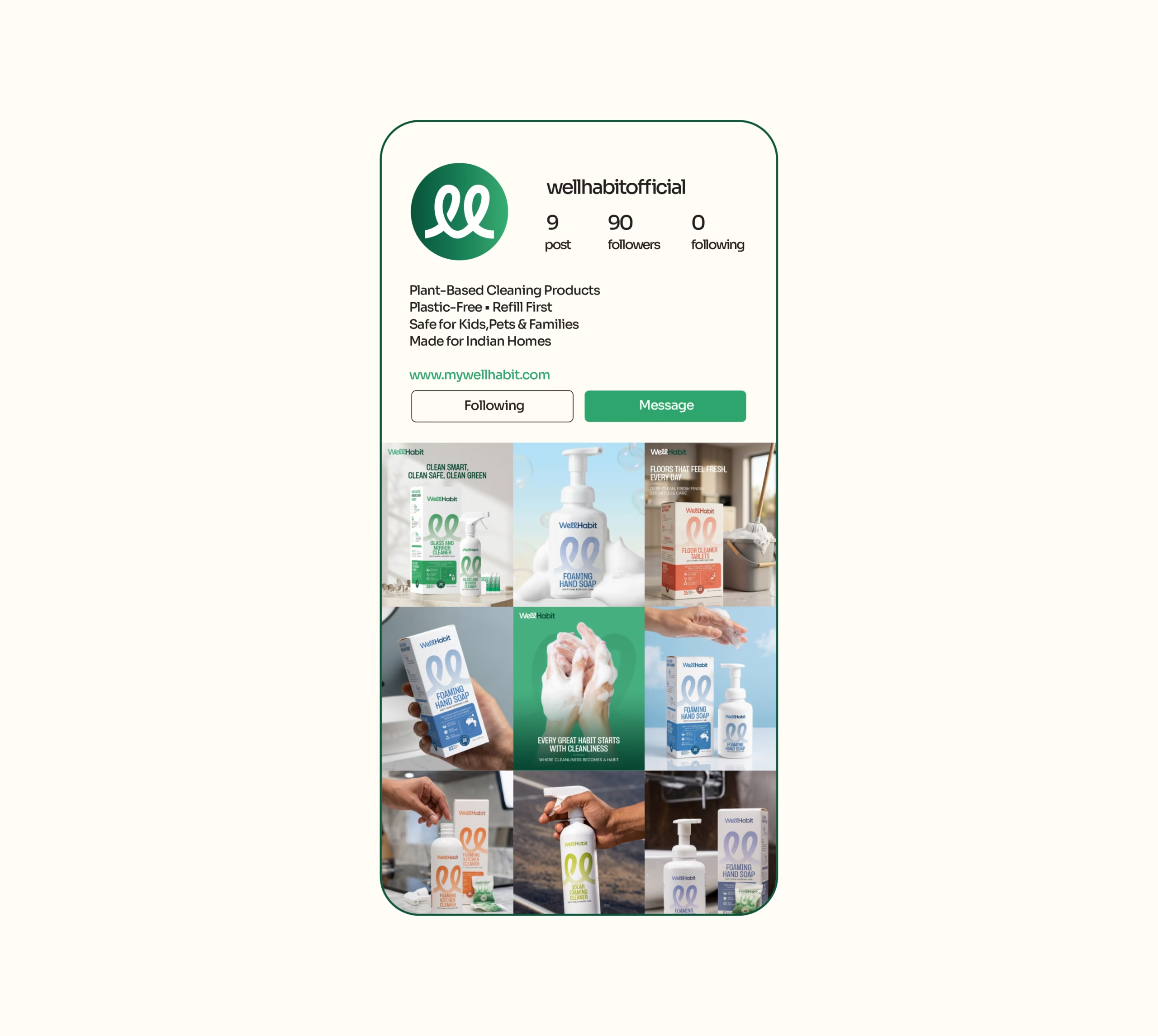
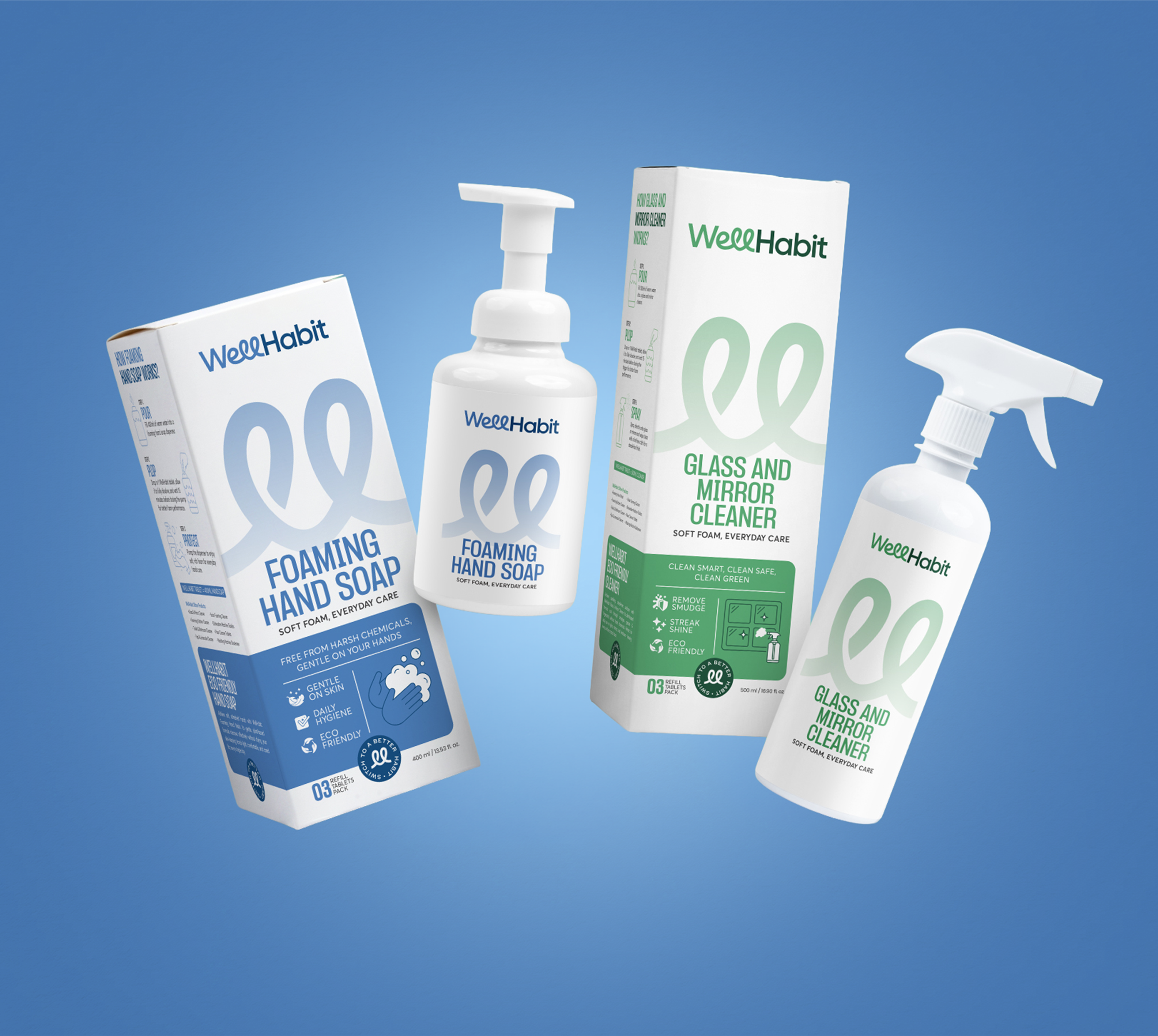
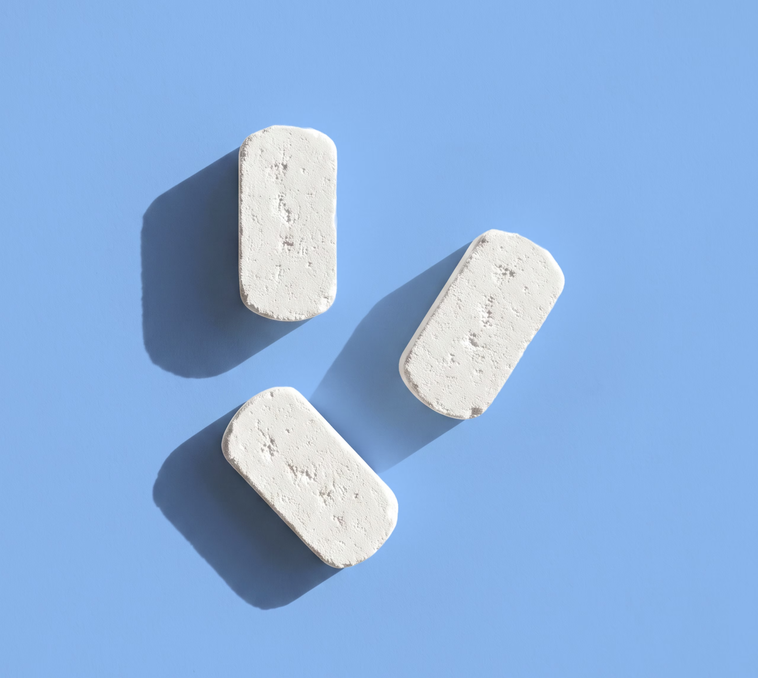
Every home cleaning product on the market ships the same lie, water, wrapped in plastic that outlives the room it cleans by four centuries. Wellhabit set out to break that pattern with plant-based, plastic-free cleaning tablets built for Indian homes. Richest Branding partnered with Wellhabit to turn a genuinely different idea into a brand people would trust enough to change a daily habit for, across identity, packaging and a complete digital experience.
Industry
Services
Challenge
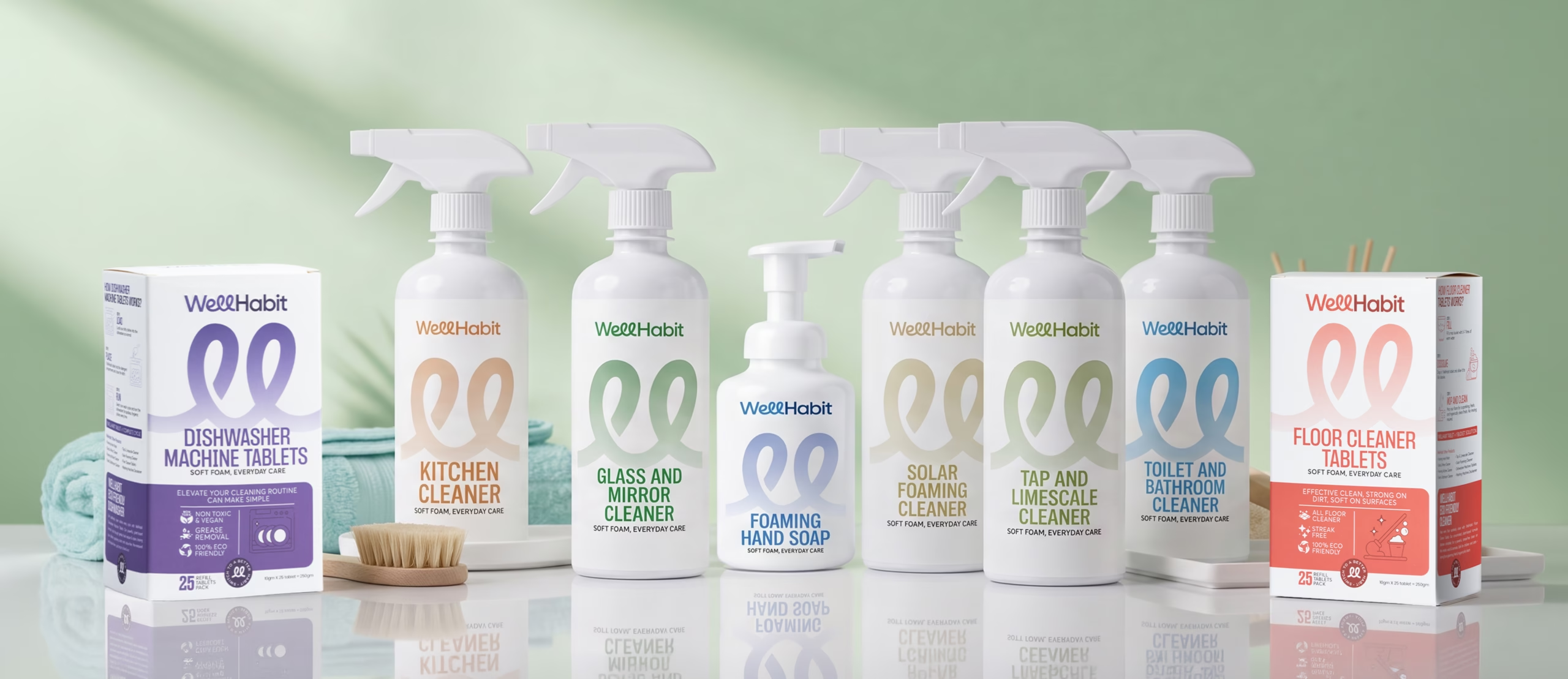
Asking someone to drop a tablet into water instead of grabbing a bottle off the shelf is a big ask. Wellhabit needed a brand that could make an unfamiliar format feel obvious, and prove in seconds that “eco-friendly” didn’t mean compromising on how well the product actually cleans. The identity had to work across eight very different product lines, from hand soap to dishwasher tablets, while staying instantly trustworthy to a skeptical, habit-driven Indian household.
Approach
We built the brand around a simple truth, why ship water when you already have it at home. Every design decision reinforced clarity and confidence over clever, a clean visual language, straightforward packaging that explains the ritual at a glance, and a colour and type system that reads modern without drifting into generic “green brand” territory. The goal was a brand a first-time buyer could understand before reading a single word.
Process
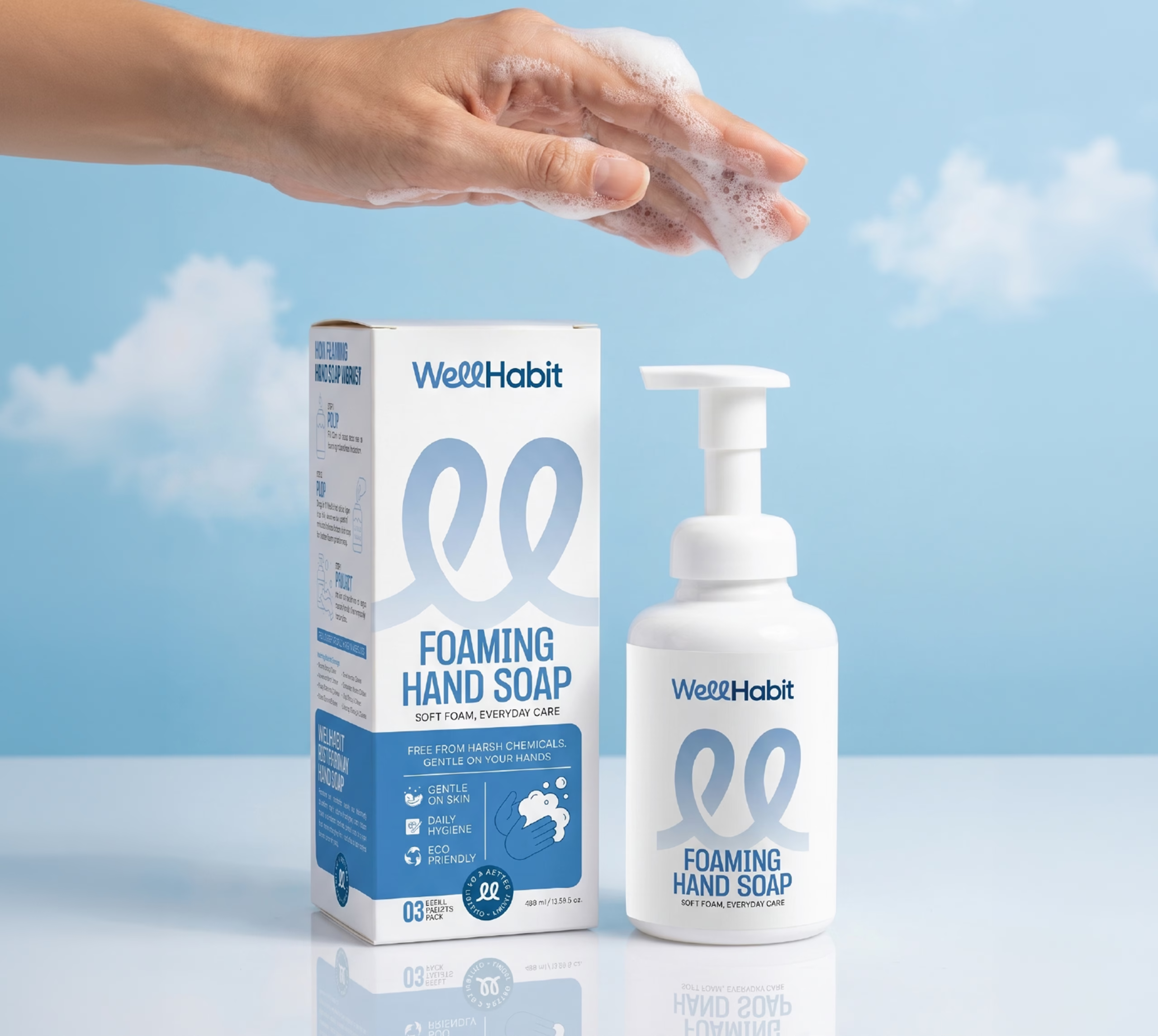
We started with the story, the same one behind every great sustainability brand, less waste without less performance, and built outward from there. Packaging was designed to walk a new customer through fill, drop, pump in seconds. From there we extended the system into a complete website experience, covering the homepage, About Us and all eight product pages, giving Wellhabit a digital home as considered as its packaging.
Result
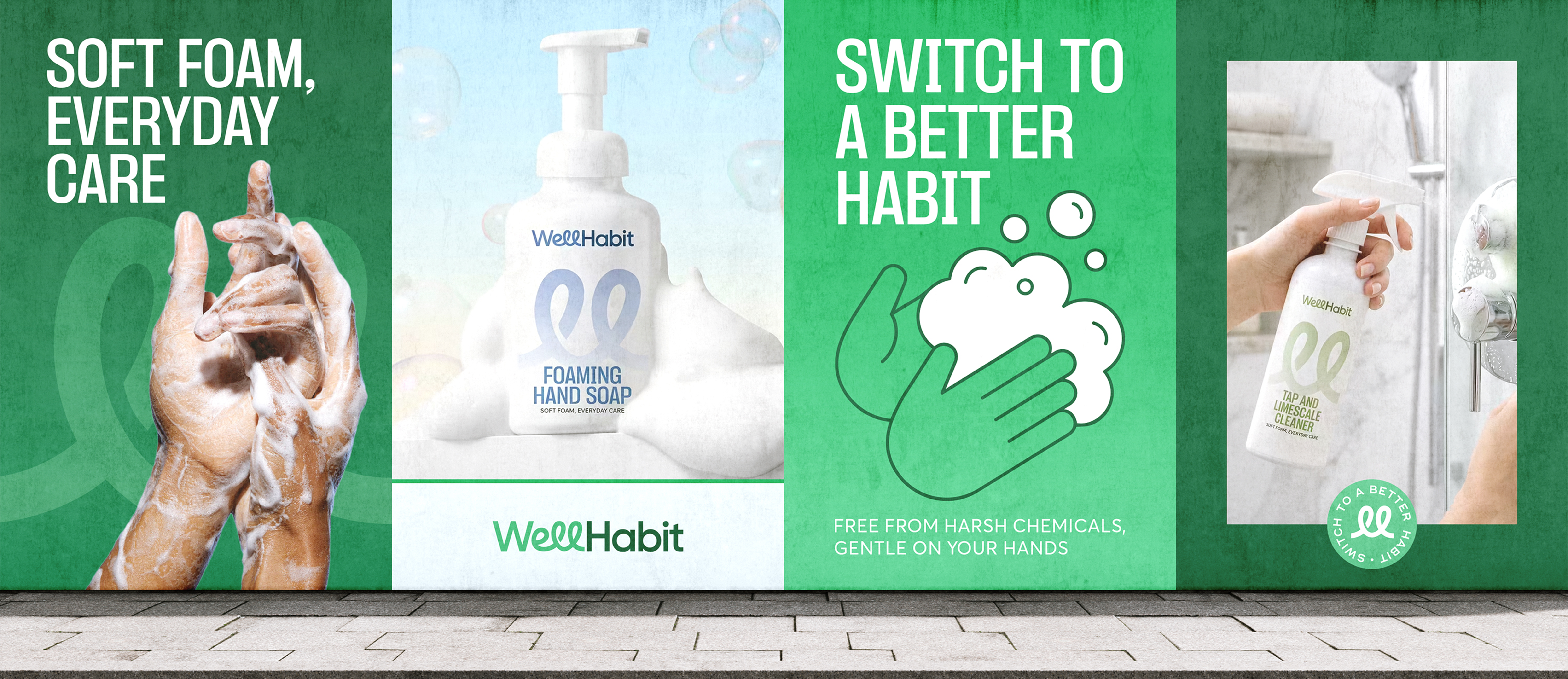
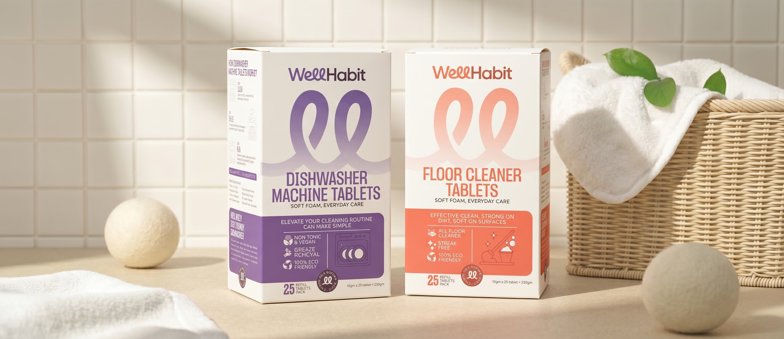
Wellhabit now shows up as a brand that feels premium, credible and genuinely different, not just another sustainable label competing for shelf space. Packaging across all eight products speaks one consistent visual language while giving each a clear, distinct identity.
The website carries that same clarity online, turning a first-time visitor’s curiosity into confidence, and confidence into a completed order.

Crafting a High Impact and Experience Driven Identity for Anand Jolliz
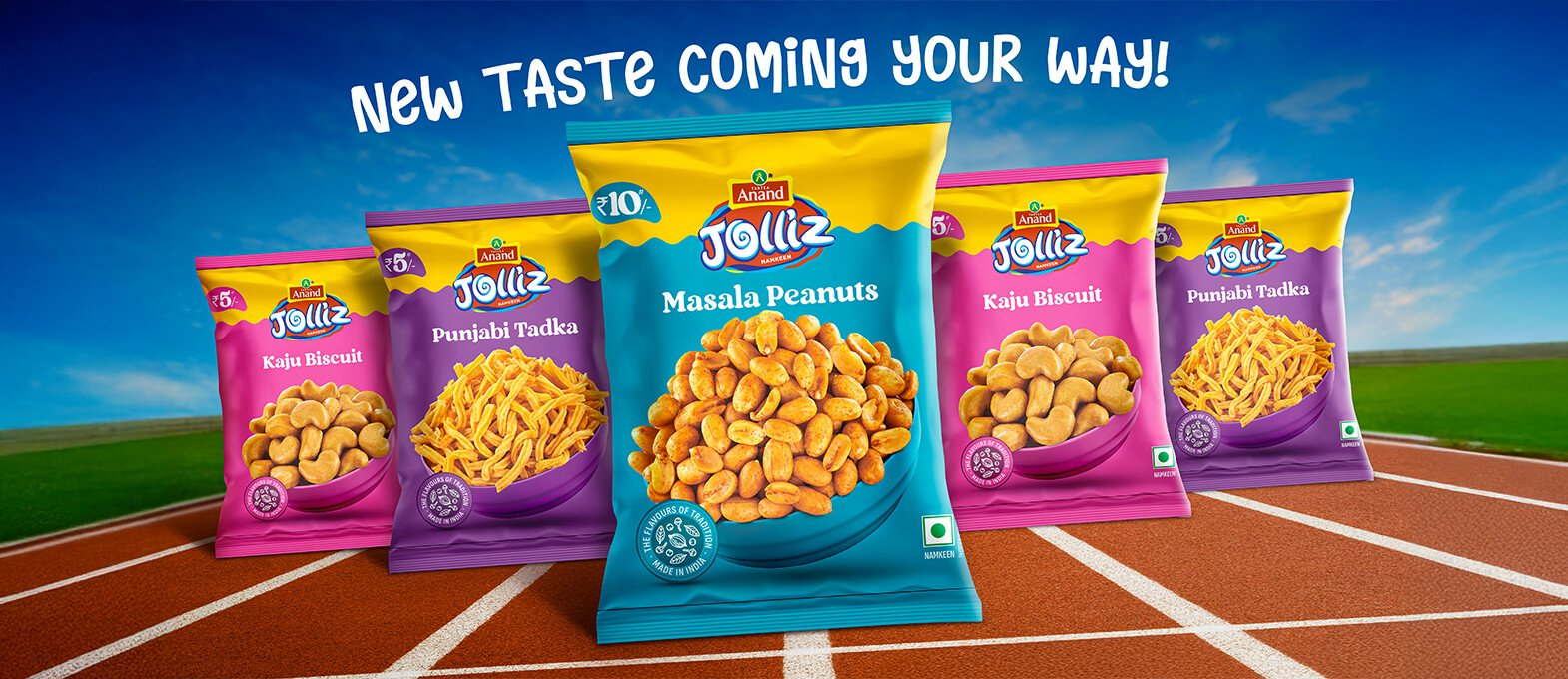
Richest Branding developed a bold, modern and high visibility communication identity for Anand Jolliz, focusing on energetic storytelling, vibrant visuals and youthful brand appeal. The identity centers around expressive graphics, fun product moments and dynamic marketing assets designed to capture attention instantly across retail, digital spaces and event environments. We created high impact banner ads, large format promotional visuals and event experience designs that enhance brand engagement and give Anand Jolliz a standout presence wherever the brand appears.
The communication system features lively color palettes, strong typography and flavorful ingredient highlights that reinforce the brand’s playful personality. Each execution maintains a consistent visual architecture that builds trust, recognition and strong recall among consumers. The branding narrative emphasizes joy, energy and everyday snacking moments, positioning Anand Jolliz as a youthful, exciting and memorable brand choice across retail shelves, outdoor promotions and interactive brand activations.

What's Next